Project/Exercise 1 - iPhone App Tab Bar Icon Design
Due: Sep 8
Objective
To learn to present concepts as visual symbols.
In addition to building these icons, you face a challenge, as you are seeking to create a unified system, yet also seeking to make each icon distinct. This project will serve as the introduction to Illustrator and Photoshop. You will also be introduced to color modes, layers, and converting vector elements to pixel.
Overview
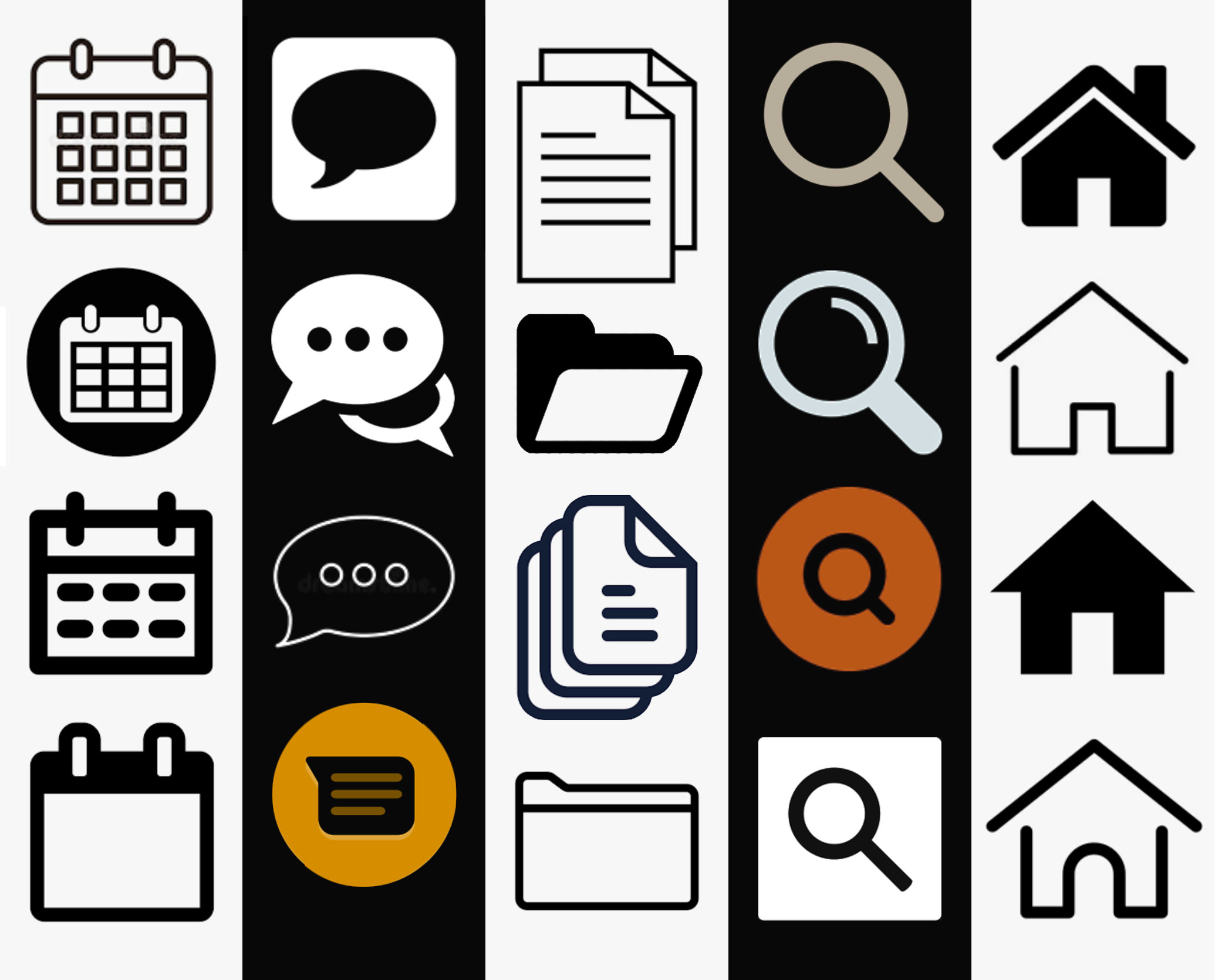
Create five icons for a tab bar for an app to run on the Apple iPhone (iOS) system in two states (active and inactive. 10 icons in total). The icons should represent the following:
- Home
- Search
- Files
- Messages
- Calendar

Icon State Consideration:
Icons can communicate more than just a location of specific features. Well-designed icons have two states — active and inactive. This helps the user identify which screen or feature is currently in use, as the active state of the corresponding icon will be displayed.
Icon Types:
Icons can be categorized into one of three types:
- Outline
- Solids
- Combination
For this project, design one set of your icons in one of these categories. Then, create a corresponding set in a different category, which could likely be a different color. An example would be having the inactive icons as white outlines on a gray background, with the active state being light blue on dark gray.
Technical Specifications:
Build the icons in Illustrator at the current standard sizes (@3x : about 75 x 75 [max: 144 x 96]). Since this is for screen media, use the RGB color setting. After finishing in Illustrator, export the files to Photoshop.
Icon Style
Remember that good icons are simplified symbols. Do not approach them as illustrations. Making an image in its simplified state is actually more difficult than rendering a complex illustration.
Research/Development Work Due
(Download and complete Concept Sheet) 30 thumbnail sketches (@ approximately 1” x 1”) of various approaches to symbols that represent the five key app functions. The first 15 sketches will be a vast exploration of various ideas, the following 15 will be a refinement of three of your very best symbols.
Note: app icon design is very unique in the design world, as we seek to reuse standard designs rather than something individual. Using a expected approach makes your app easier to use.
Final Work Due
One PDF, saved at letter size, 8.5” x 11” showing all ten icons.
Place the PDF on the “Student Turn In” section of the Graphics Server. The file should be named in this manner; “Student’sLastName-iPhoneAppTabBar.pdf”
Required Reading
Focus Design Principle(s)
Unity, Simplification


