Project 2: Literacy Link Booklet:
Objective
To improve as a typographer. To learn to pay careful attention to the intricacies of article layout.
To improve a student’s ability to move viewer through stages/hierarchical stepping stones of type. To review the grid system and improve use of InDesign. To avoid common mistakes often called typographic sins.
Overview
Design the supplied text into a tasteful Literacy Link booklet. Read through the articles for inspiration.
Review multiple magazines for design references. Do not change the title of the articles. All of the supplied text needs to be shown (this applies to all files supplied). Students will be constructing their design only with the use of letters (no photos, illustrations will be used. Simple vector images are okay).
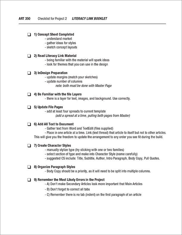
Research/Development Work Due
(Download and complete Concept Sheet) Write out a plan for your design approach, consider market, the articles message, and color schemes. Render three rough thumbnail sketch sets (a set consisting of the cover, the table of contents, article 1 intro spread, and article 2 intro spread).
Plan your layout arrangement and explore color choices. Grading will be based upon students composition of individual pages, experimentation of layout choices, ability to follow instructions and craftsmanship / presentation. Key to this assignment is arranging the primary and supporting text. Illustrations and display type should not be used.
Final Work Due
Save file as a digital PDF. Place the PDF on the “Student Turn In” section of the Graphics Server. The file should be named in this manner; “Student’sLastName-LiteracyLink.pdf”
Focus Design Principle(s)
Grid layout, hierarchy, visual stepping stones, and color schemes
About Project 2
Good Typography is Like Good Music — they have rhythm.
Compare the key elements Project 1 and Project 2.
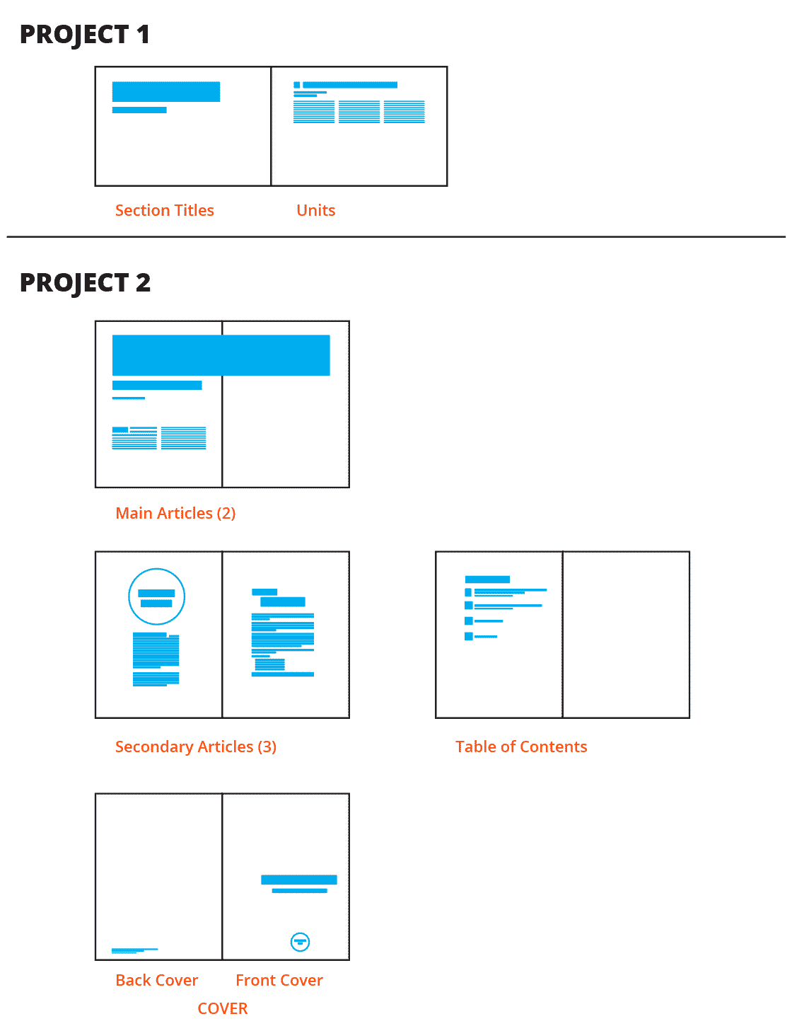
POINT: Project 1 had two levels, Project 2 has multiple levels. Build Character and Paragraph Styles for this situation.
 Download: Project Concept Sheet
 Download: Template
 Download: Raw Text Files
Note: Files are zipped into one document
Download: Raw Text Files
Note: Files are zipped into one document